Comparing Five Favorites
A Collections Chronicles Blog
by Michelle Kennedy, Manager of Collections and Archives
January 25, 2024
At the end of 2023 and in the first few weeks of 2024, I’ve spent more time writing up memorandum, inventory plans, and project proposals, than doing any direct collections care work. Instead of unframing prints, digitizing photograph negatives, or updating finding aids, I’ve been sitting down at the computer and summarizing our 2023 efforts, or thinking through each step of collections management activities’ priorities in 2024.
Even though working with artworks and artifacts is one of the best parts of my job, this is still my favorite time of year.
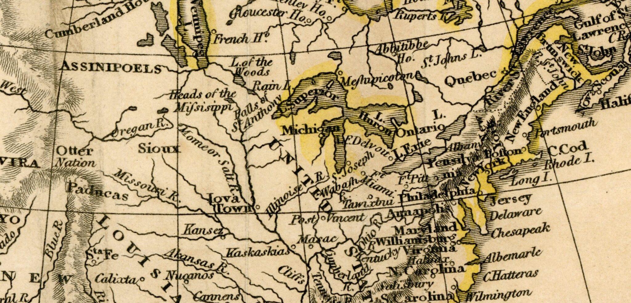
I’m not going to wax too poetic on the importance of documentation and logistics, but I think that my love for visualizing projects is part of what draws me to the maps, atlases, and charts held in the Museum’s collections and archives. These objects can represent anything from local ferry routes to the currents of Earth’s oceans; each one simplifies, distorts, and prioritizes certain aspects of the world, in order to create a “useful” picture of complex phenomena.
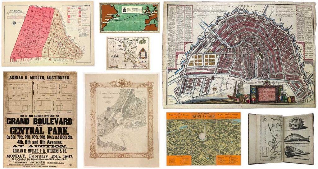
Examples of maps and charts in the South Street Seaport Museum’s collections and archives, 1650–1939.
The intended (and unintended) use of these maps is reflected in their physical forms—whether they are single sheets, bound into books, or how they were annotated or folded. I’m not a historian or cartographer, but noticing and documenting these physical differences is part of managing them in the collection. Though they are all maps, how they are cataloged can vary widely.
Below are five examples of maps here at the South Street Seaport Museum that, aside from being interesting in their own right, I appreciate since they illustrate different aspects of collections management.
Map #1: Tabula Anemographica seu Pyxis Nautica
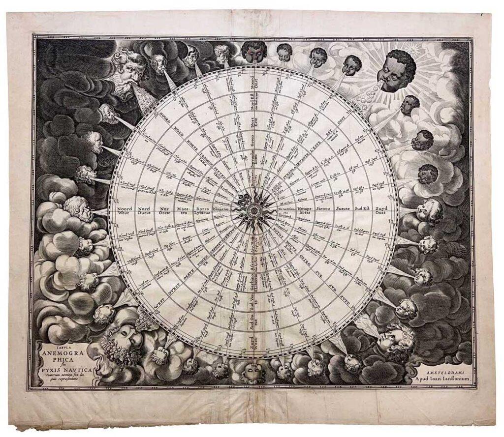
Jan Jansson (Dutch, 1588–1664). “Tabula Anemographica seu Pyxis Nautica”, ca. 1650. Gift of Charles Gordon 1980.249
I wanted to start off with a map that is “just” a map. By that I mean that it is a single-sided engraving on paper with no annotations from previous users. The story of how this map came to the Museum is also straightforward and well documented; but first let me describe what we are looking at.
This mid-17th century map is an early example of an anemograph, or a map that plots winds. It names 32 different winds in six languages (Latin, Dutch, Greek, Italian, Spanish, and French). For mariners of the time, it wouldn’t have been unusual to have sailing directions relayed in terms of which winds to sail by and for how long, such as “follow the north wind for four days, then turn into the east wind.” Being able to translate these cardinal winds between the many languages spoken around the Mediterranean Sea would have been critical.
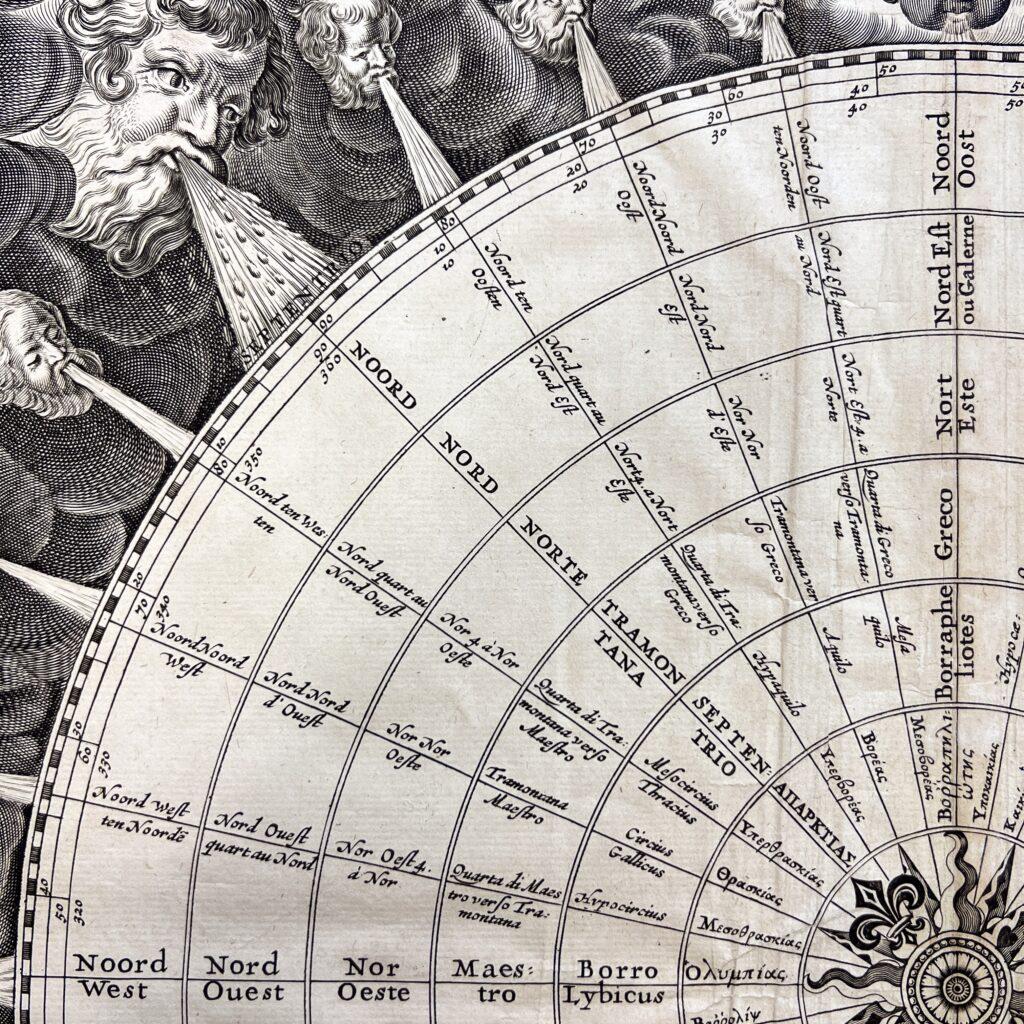
So how did this object come to the South Street Seaport Museum? This map was donated in 1980 and accessioned into the permanent art collection in the same year. (Fun museum fact: the inventory numbers assigned to artifacts often correspond to the year they were accessioned; so this object “1980.249” was the 249th acquisition and formal accession in the collections of the Museum in 1980!)
As a donation consisting of a single artifact, “Tabula Anemographica seu Pyxis Nautica” doesn’t have relationships to other objects in the Museum’s collection in terms of provenance. In order for me to describe this map in the paragraph above, I looked to other collections, like the David Rumsey Historical Map Collection at Stanford Libraries, that published their research into their versions of the same map.
However, as we will see in our next map, sometimes the historical context of an artifact can only be found within its own collection.
Map #2: Chart of New York Harbor
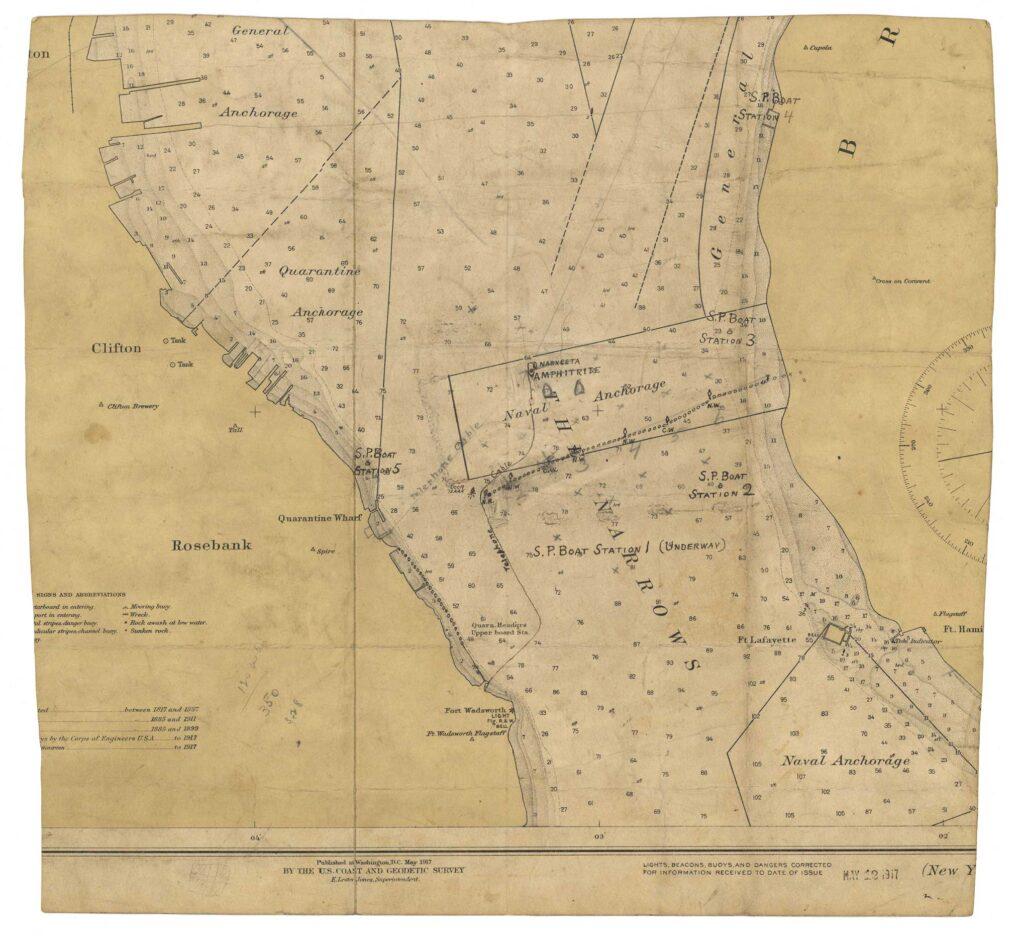
United States Coast and Geodetic Survey. “Chart of New York Harbor”, 1917 (publication date). Gift of Harry H. Caldwell, Jr. 1994.012.0004
What could be complicated about a 1917 chart of New York Harbor? Let’s take a look.
Unlike the anemograph, this map shows heavy signs of use. For one, someone has cut this fragment from a larger published chart; the edges of the map are uneven and the cuts were made through blocks of text and the compass rose. Though the full name of the chart has been cut away, it is easy enough to look at the remaining text and determine that we are looking at the Narrows—the natural channel that connects Upper New York Bay and Lower New York Bay, which is today crossed by the Verrazano-Narrows Bridge.
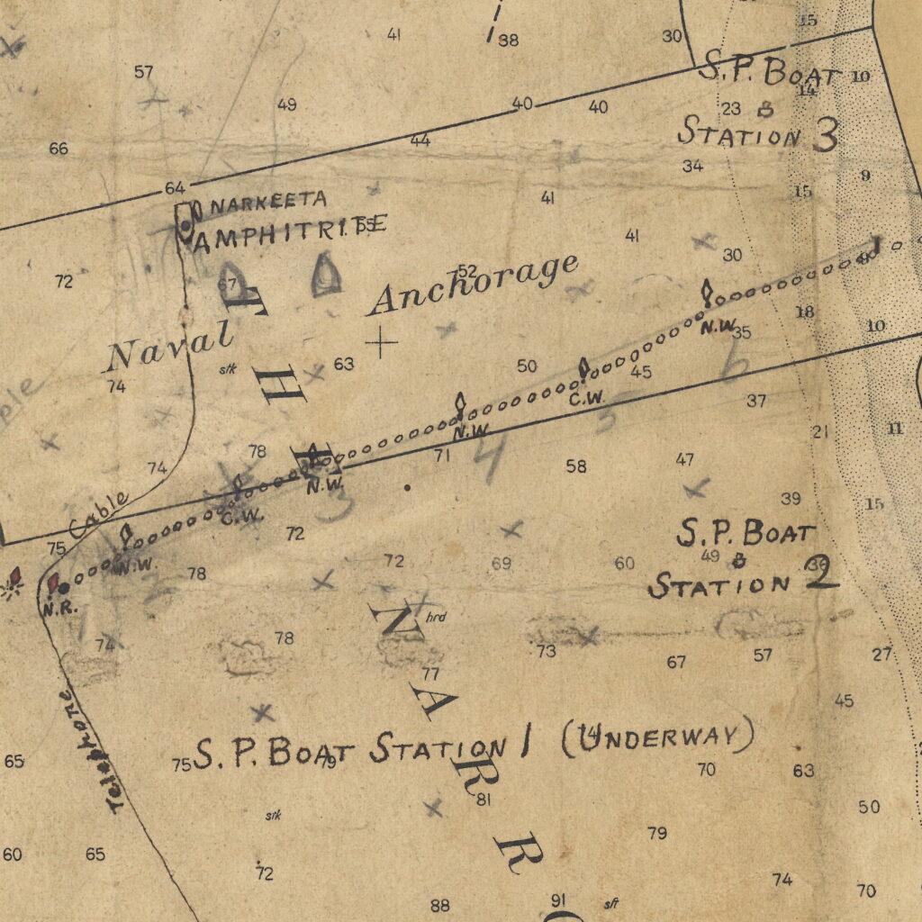
At the center of the Narrows, we can see that the chart is heavily annotated in both pen and pencil. There is a dotted line stretching across the “Naval Anchorage” zone; several places are marked as “S.P. Station” numbers 1 through 5; and there are two names, “Amphitrite” and “Narkeeta”, written close together.
Thankfully we don’t have to puzzle out the context of this map since it was donated as part of the Harry Handly Caldwell Collection. The collection includes books, documents, artifacts, and letters belonging to Commander Harry Handly Caldwell Sr. (1873–1939) relating to his career in the United States Navy. Though Caldwell’s entire naval career and collection are deserving of their own blog post, we can find the specific context for this 1917 chart fragment in the records of Caldwell’s service during World War I.
On May 10, 1917, Harry Handly Caldwell was given the command of USS Amphitrite—a double-turret monitor that was stationed to guard New York Harbor. Aside from reporting all incoming ships, Caldwell was in charge of the anti-submarine net that was placed across the Narrows to deter or catch German U-boats.
With the contextual information provided by the correspondences and photographs in the Caldwell collection, we can make some interpretations of the chart: the “S.P. Stations” are Section Patrol Stations; the dotted line marks the anti-submarine net; and the “Amphitrite” is of course the very ship Caldwell was commanding while “Narkeeta” is the attendant Navy tugboat USS Narkeeta. We can also hazard a guess that the rest of the chart was cut away since it wasn’t used by Caldwell for navigating the entire Harbor, but to mark locations of important defenses in the Narrows only.
This map illustrates one of the reasons why tracking the donation history of artifacts is important. If this map was somehow completely separated from the rest of the Henry Handly Caldwell Collection, we wouldn’t know how this map was used, and by whom, and in turn why it is significant to the story of New York Harbor during World War I. In the case of the Caldwell Collection, the chart was given accession number 1994.012.0004, marking it as the 4th item processed with the accession 1994.012.
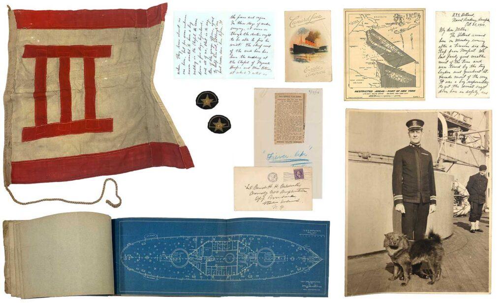
Items from the Harry Handly Caldwell Collection, 1887–1939.
The tracking and accessioning of the Caldwell Collection is a bit more complex than the singularly-donated anemograph described earlier: this collection actually arrived over several different years and several accessions were created to track the growing number of artifacts. One strategy for summarizing the connections between hundreds of items created and/or arranged by an individual (like Commander Caldwell) is the archival finding aid. Finding aids can include a lot of information about the archival collection as a whole that can be difficult (or repetitive) to add to each and every item record. For many archival collections, like those that encompass thousands of documents, assigning individual accession numbers would be too resource intensive and have little benefit over broader descriptions of the collection.
Instead of looking at other institutions for more information on the 1917 chart fragment, I looked at the Henry Handly Caldwell Finding Aid, which was updated last year. It includes a short biography of Cmdr. Caldwell, a description of how the collection came into the Museum, and additional research into the connections between different items.
Caldwell’s 1917 map and the ca. 1650 anemograph were both accessioned into the Museum’s permanent collection; however, there is more than one system for tracking objects at a cultural heritage institution. Our next two maps weren’t assigned accession numbers at all.
Map #3 Atlas – Topographical Atlas of The City of New York
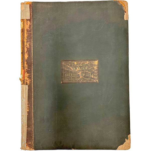
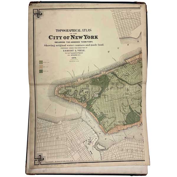
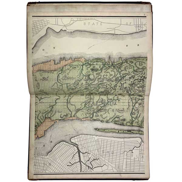
Egbert L. Viele (American, 1825–1902); Eugene Quackenbush (American, 1847–1927). Topographical Atlas of The City of New York including the Annexed Territory, 1874. South Street Seaport Museum Archives.
Maps aren’t always found as a single sheet of paper. This 1874 map of Manhattan and the Bronx is printed on multiple sheets and bound into a book. Atlases often contain several different maps, but this example only contains the one map spread over several pages.
One of the most important and enduring maps of New York, the Viele Map continues to be used by City engineers today. Egbert L. Viele (1825–1902), originally published his map in 1865 in order to show the topography and watercourses of Manhattan Island. It shows swamps, ponds, sewers, and the landfill that expanded the edges of Manhattan into the East and Hudson Rivers. Viele was largely concerned with how the growing metropolis had altered the natural drainage of the island, and the repercussions for public health. Today, this map is still used by developers to understand how their projects might impact, or be impacted by, the natural courses of water that continue to flow beneath our streets[1]“When There Was Water, Water Everywhere” by Steven Kurutz. New York Times, June 11, 2006. https://www.nytimes.com/2006/06/11/nyregion/thecity/11viel.html. This 1874 edition was expanded upon by Eugene Quackenbush (1847–1927), under the direction of Viele, to include the newly-annexed Bronx.
The atlas format has some practical advantages over a single, folded sheet; the book covers are a layer of protection and are easy to store on a shelf or carry from site to site. The disadvantage of the book format is that it’s not possible to see the entire map at once.
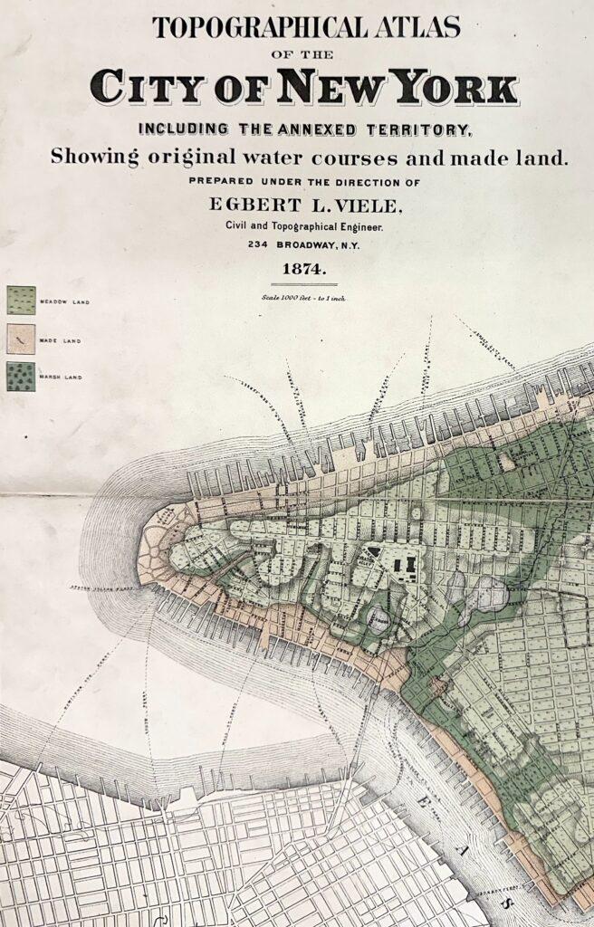
Many historical atlases have actually been unbound. We can imagine someone who has an atlas, maybe like Topographical Atlas of The City of New York, but would rather trade in the advantages of a book in order to see the whole view. Maybe this person would like to see their entire map hung on the wall as an artwork.
In the case of art dealers or booksellers, it can be more profitable to sell maps individually than to sell the complete atlas. The 1874 Viele Map held at The New York Public Library Lionel Pincus and Princess Firyal Map Division is an example of one that has been compiled into a single, long, map.
In a twist that some of you may have seen coming, the first map in this blog post was actually originally published as part of a larger atlas[2]“Tabula Anemographica seu Pyxis Nautica.” Views: Portraying Place and Space, David Rumsey Map Center at Stanford Libraries, 2017. … Continue reading. It is a good example of how the use of an artifact can change over time—in this case changing from a component of a larger intellectual work to an individual artwork for display. We don’t have a record of why or how long ago it was separated, but it was likely removed before the anemograph came into the donor’s possession, since the donation papers don’t mention the original atlas.
Returning to how items are tracked in the Museum’s archives, this Viele Map was not assigned an accession number when it came to the South Street Seaport Museum. Instead it was added to the Map Collection, where it joined a number of non-accessioned maps and atlases managed with an archival finding aid.
You may wonder why this map, which is in the form of a book, wasn’t added to the library rather than the archives. Let’s answer that by looking at a map that is part of the South Street Seaport Museum Reference Library.
Map #4 – Port and Terminal Facilities at the Port of New York
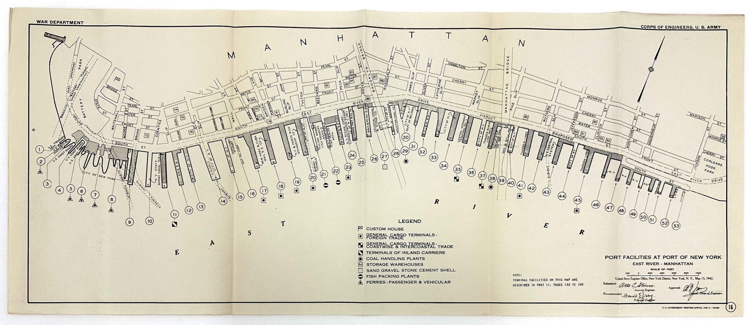
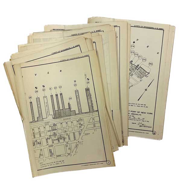
US Government Printing Office, publisher. [Map 16 from Port and Terminal Facilities at the Port of New York], 1942. South Street Seaport Museum Reference Library HE554.N7A51942pt.III
Our example map from the Museum’s Reference Library is from Port and Terminal Facilities at the Port of New York, published by the US Government Printing Office in 1942. The publication is in three parts: Part 1 is subtitled “General Report;” Part 2 is “Piers, Wharves, and Docks (Statistical Data);” and Part 3 is “Port Facilities Maps.”
In 1902, the US Congress created the Board of Engineers for Rivers and Harbors to better manage the country’s “water resources” such as ports, rivers, and canals. For the many harbor and river improvement projects that could be taken on by the US Army Corp of Engineers and make use of federal funds, the Board of Engineers applied a uniform criteria to recommend which projects should be approved. The Board also assisted with the Port Series Reports, which collated data on waterways and transportation hubs across the United States[3]“Historical Vignette 052 – Congress created the Board of Engineers”, U.S. Army Corps of Engineers, accessed January 19, 2024. … Continue reading.
This 1942 Port and Terminal Facilities at the Port of New York was published with an extra layer of urgency. The first page of the report states “The report has been compiled especially for the use of the Ocean Shipping, War Trade, and Transportation Sections of the Liaison Division of the Army and Navy Munitions Board.” The United States had entered World War II in December 1941, so having up-to-date descriptions and diagrams of the nation’s port facilities became a high priority as the armed forces mobilized overseas. The covers of the copies in the Museum Library are stamped “UNCLASSIFIED”, referring to the fact that during the war the information in the report was critical to national defense.
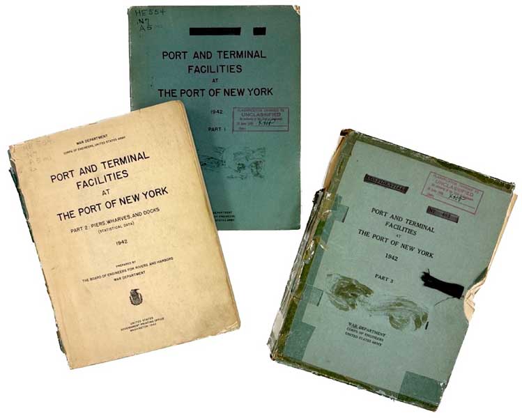
US Government Printing Office, publisher. Port and Terminal Facilities at the Port of New York, 1942. South Street Seaport Museum Reference Library HE554.N7A51942
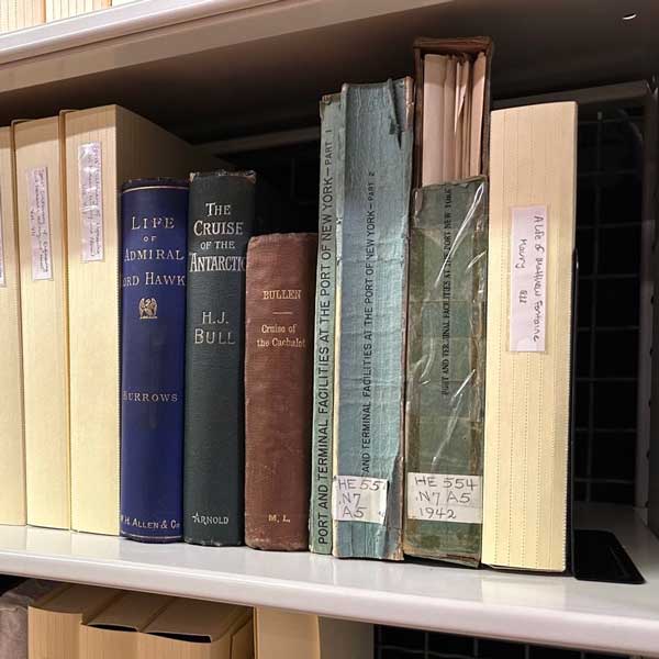
Instead of the accession numbers used to track artifacts in the Museum’s permanent collection, these three volumes have been assigned library “call numbers.” If you’ve ever checked out a book at your local library, you may be familiar with library numbering systems like Dewey Decimal Classification. Dewey Decimal is the most common library classification system in the world[4]“Introduction to the Dewey Decimal Classification”, OCLC, copyright 2024. https://www.oclc.org/content/dam/oclc/dewey/versions/print/intro.pdf, but there are many others. The South Street Seaport Museum uses the Library of Congress Classification, which was originally developed for the collection of the Library of Congress in Washington D.C., but has been adopted by many academic and research libraries since it allows for greater subject specificity when classifying items than Dewey.
Instead of tracking the provenance of individual items like accession numbers, or describing deeply connected items in archival collections like a finding aid, library call numbers are a tracking system that prioritizes keeping publications about similar subjects next to one another on the shelf. Library numbering assists with how many libraries function, with patrons independently browsing the shelves and pulling books they would like to check out.
Thinking about how library call numbers and browsing by library patrons work well together, we can make an assumption as to why the 1874 Viele Map wasn’t assigned a call number. The Viele Map is much more rare, delicate, and monetarily valuable than the 1942 Port and Terminal Facilities (and 99% of the Reference Library publications.) The Museum could theoretically replace a Reference Library book, or know that it would be accessible at many other libraries, if it was damaged or lost. The choice to add the Viele Map to the Map Collection in the archives meant that it wasn’t added to the library shelves for free browsing, but instead held in a separate part of storage for access on request. In fact, many of the books in the Museum’s Rare Book Collection (which holds books published prior to 1900) aren’t assigned library call numbers for this very reason.
Map #5 – Printing plate for chart of Trinidad and Tobago
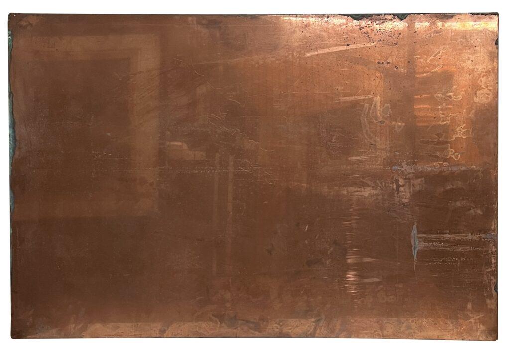
National Steel and Copper Plate Company, manufacturer. [Printing plate for chart of Port of Spain], early 20th century. Gift of Thomas A. Turley 2003.038.0002
This final “map” has the most distinct physical form on this list; it weighs 18 pounds, is made of copper alloy, and all of its text is backwards.
The majority of the maps listed above were made via engraving. A metal plate was inscribed with the lines and text of the map, and then this plate was coated with ink. The ink gathered in the fine lines of the plate and the rest of the plate was cleaned. Dampened paper was placed against the metal plate and both were run through a printing press together. The pressure of the press forced the ink in the plate and the paper together, creating a print on the paper.
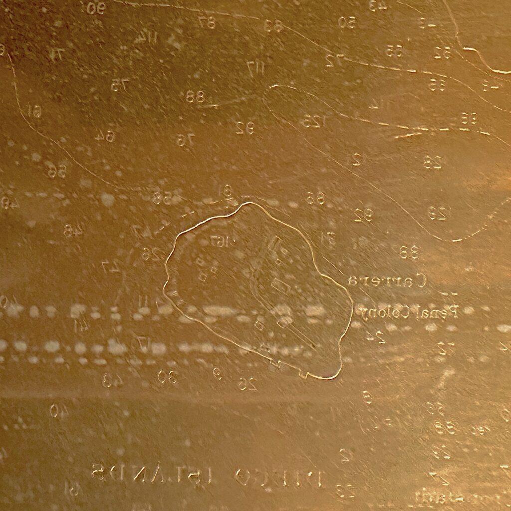
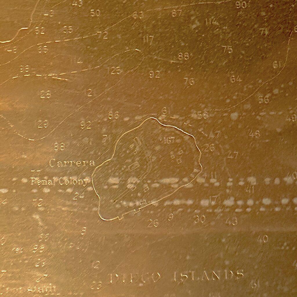
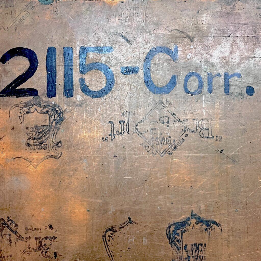
[Details from printing plate for chart of Port of Spain], early 20th century. Gift of Thomas A. Turley 2003.038.0002
Our example is an engraving plate that was used to produce a navigational chart of the islands and coastline west of Port of Spain, capital city of Trinidad and Tobago. The engraving lines are so fine that it can be almost illegible without a strong light, and even then the plate is a mirror-image of the final print making text harder to read.
Aside from assessing the condition of the plate itself, during my cataloging I was hoping to find a print of the chart, either in the Museum’s collection or elsewhere online. I was unsuccessful, in part because I found no title, legend, or maker’s statement on the plate; however, the back of the plate does have some inscriptions including “2115-Corr.” I tried a hail-mary Google search with the terms “chart,” “Port of Spain,” and “2115” and was directed to a 1903 Catalogue of United States Public Documents. On page 286 there is a title “Port of Spain, Trinidad Island, W. I., from British surveys between 1849 and 1901; chart 2115.” Since I couldn’t find a digitized version of this chart, I’m not going to say 100% that it’s a match, but I’ve left a note in the plate’s catalog entry for any future researchers who want to look into it.
This map is tracked in the collection the same way as the anemograph, with an accession number; but (aside from being a chunk of metal), what makes this map distinct from the others in this post is that it is not cataloged as a “map” at all. In the Museum’s collection management database, it is classified as a “Printing Plate” along with other copper engraving plates and woodcut blocks. This isn’t an incorrect classification since this plate was used to create maps, not actually ever used as a map itself.
However, we can imagine someone looking through the Museum’s collection for all maps, atlases, and charts, who would be very interested in a plate like this one. If they only searched for objects classified as “Maps” this interesting object wouldn’t come up as a result. It’s an example of how classification and cataloging can simplify searching through a collection, while also obscuring other aspects of the same artifacts.
Conclusion
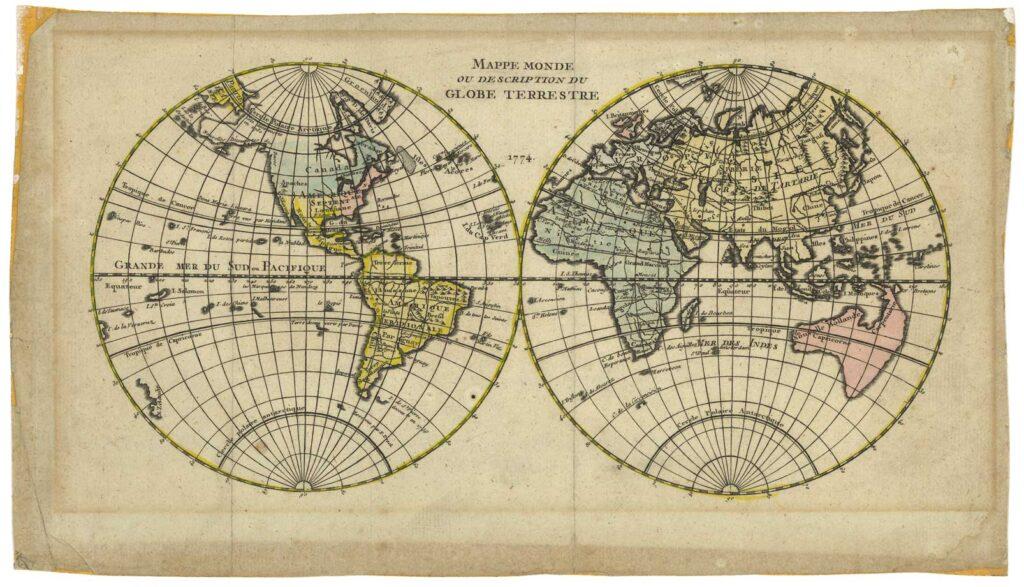
“Mappe Monde ou Description du Globe Terrestre”, 1774. Gift of Joseph Cantalupo 1978.031.0014
Aside from sharing a few favorite maps from the South Street Seaport Museum’s collection, archives, and library, I’m hoping this blog post is also a brief look into some of the many cataloging and inventory strategies that can be used to care for cultural heritage. These different strategies, which come from the disciplines of museum registration, archival and library science, can easily be found in a single institution like the Seaport Museum. Which cataloging strategy is applied to a given object depends, in part, on its intended use and physical form; the same map that is printed as a book, or as a poster, or as a 3D globe can be classified very differently.
The most important takeaway for me is that there is no single cataloging system that perfectly describes and tracks every kind of artifact for every single cultural institution. These different strategies are similar to maps themselves in that they are only representations of a greater whole. Each cataloging system simplifies, distorts, and prioritizes certain aspects of artifacts, in order to create a “useful” picture of a complex assemblage of objects.
Having some understanding of how museum registration, archival practice, and library science differ and complement one another has been extremely useful in caring for the Seaport Museum’s varied collections. It can also be a great set of tools for anyone researching across museums, archives, and libraries. It’s like exploring anything new; the more maps the better!
Additional sources and reading materials
“David Rumsey Map Collection” David Rumsey Map Center, Stanford Libraries.
“Museum-Speak: A Numbers Game”, Harvard Art Museums, June 23, 2015.
“Cataloging Tools and Resources: Classification” American Library Association, updated June 27, 2022.
“What is a Finding Aid?” Introduction to Archival Research, University of Colorado Boulder Libraries, updated October 25, 2023.
References
| ↑1 | “When There Was Water, Water Everywhere” by Steven Kurutz. New York Times, June 11, 2006. https://www.nytimes.com/2006/06/11/nyregion/thecity/11viel.html |
|---|---|
| ↑2 | “Tabula Anemographica seu Pyxis Nautica.” Views: Portraying Place and Space, David Rumsey Map Center at Stanford Libraries, 2017. https://exhibits.stanford.edu/views-portraying-place-space/catalog/74-4110 |
| ↑3 | “Historical Vignette 052 – Congress created the Board of Engineers”, U.S. Army Corps of Engineers, accessed January 19, 2024. https://www.usace.army.mil/About/History/Historical-Vignettes/Civil-Engineering/052-Board-of-Engineers |
| ↑4 | “Introduction to the Dewey Decimal Classification”, OCLC, copyright 2024. https://www.oclc.org/content/dam/oclc/dewey/versions/print/intro.pdf |
